News and inspiration for entrepreneurs and creatives, plus updates on new developments at Hatchwise.
Home / Blog Posts / Featured Design Contest: Aim Realty – High-end Real Estate Logo
Hatchwise is #1 in Creative Custom Logo Design and Eyecatching Marketing Material Design.

Featured Design Contest: Aim Realty – High-end Real Estate Logo
Creating a unique brand identity is essential in the competitive and fast-paced real estate industry. AIM Realty, a high-end real estate company located in Florida’s scenic 30A corridor, understood the importance of a strong logo to communicate its values and draw in its target market of real estate investors.
The company approached Hatchwise to create a logo for its brand. In this blog article, we will examine AIM Realty and look through the specifications they established for their Hatchwise logo design contest.
About AIM Realty
AIM Realty is a prestigious real estate company representing the Panhandle of Florida from Navarre to Panama City Beach. This real estate industry leader is tucked away in a holiday spot renowned for its immaculate beaches and affluent neighborhoods.
The majority of their target market is made up of astute real estate investors looking for houses as well as investment and lifestyle opportunities.
Requirements for Logo Design
AIM Realty’s logo aimed to capture its essence as a high-end real estate company. Their specifications were detailed and they emphasized the following components:
- Sleek and Clean Design: To represent their dedication to professionalism and excellence, AIM Realty sought a logo that radiates elegance and cleanliness.
- Elegant and Authentic Feel: The emblem should exude an air of well-established legitimacy, bolstering the reliability that potential investors look for.
- Arrows: AIM Realty recommended that arrows be included in the design, however, they are not required. These arrows could stand for development, direction, and advancement.
- Slogan Inclusion: Included in the logo is the optional slogan “Asset Investment Management,” which could be used or left out based on how well it fits with the overall design.
- Flexibility across Multiple Platforms: The logo has to be flexible enough to be used on print materials (business cards, letterheads, brochures), products (mugs, t-shirts), websites, social media, and billboards.
- Color Scheme: Black, white, and gold or navy, white, and gold are the two alternatives offered by AIM Realty. The option to select the color scheme that best fit the logo was granted to the designers.
First Design
This logo expertly combines the letters “A” and “M” in a striking and lavish white and gold color scheme. The letters are intertwined with an elegant arrow that gently flows between them to represent growth and progress—two characteristics that are great for real estate investors. The style conveys professionalism and dependability, making it a standout and adaptable option for AIM Realty’s branding requirements.

Second Design
In this design, the letters “A” and “M,” both in gold, are cleverly represented by fractions, with an arrow serving as the separator. Below, the word “Aim Realty” is written in bold. The design displays polish and accuracy, while the naval background communicates professionalism and trust.

Third Design
Lowercase letters are used in this logo’s basic design to spell out “aim.” The design is made more elegant by adding a hint of gold to the initial letter. In the word “aim,” an arrow denotes progress and direction.
The nicely written corporate name “Am Realty” appears underneath “aim.” This logo, set against a black backdrop, conveys sophistication and professionalism, serving as a memorable and eye-catching representation of AIM Realty.
Fourth Design
The letters “A” and “M” in this logo combine flawlessly with an arrow to resemble a soaring bird. Against a dark background, the entire artwork is tastefully rendered in gold.
This design epitomizes development, advancement, and independence and represents AIM Realty’s dedication to assisting investors in reaching new heights in the real estate market. It is a compelling and meaningful logo for AIM Realty because the use of gold on a black backdrop exudes wealth and sophistication.

Fifth Design
The letter “M” in this logo is large and fashionable, and a semicircle has been drawn beneath it. The “M” is gently cut by an arrow that ascends from bottom to top, giving the impression of movement.
The primary gold hue, which is emphasized with white accents, conveys richness and sophistication. This design emanates grandeur and professionalism and represents AIM Realty’s dedication to upgrading real estate investments.
Sixth Design
This logo exhibits an alluring fusion of originality and sophistication. Elegant white is used to creatively style the letters “A” and “M” into the shape of a pentagon. The pentagon is gently traversed from bottom to top by a striking gold arrow signifying progress and direction. The name of the business and its slogan are written below this original artwork.
The background includes an outline of big buildings, enhancing the aesthetic appeal and highlighting AIM Realty’s emphasis on real estate and investment. This logo effectively conveys innovation, expansion, and professionalism, making it an excellent option for the brand identification of AIM Realty.

Seventh Design
The word “AIM” is skillfully designed in this final design to resemble a bridge. The characters are smoothly traversed by an arrow, signifying progression and connection.
This imaginative logo effectively communicates AIM Realty’s dedication to creating connections within the real estate industry. The design creates a sense of unity, direction, and growth, making it a memorable and meaningful reflection of the company’s objective.
Eighth Design
This logo has a genuinely unique and fashionable design. It effortlessly combines the letters “A” and “M” with an arrow to create a striking and distinctive emblem. Black and gold are used in a tasteful combination over a pure white background, giving off an air of refinement and grandeur.
To ensure clarity and recognition, the company name and motto are deliberately positioned beneath the design. This logo is a striking option for the face of AIM Realty since it embodies a feeling of creativity and elegance.
Ninth Design
This logo exemplifies inventiveness as the letters “A” and “M” and the arrow cleverly come together within a circular shape to form the word “AIM.” White and black make up the tastefully understated color scheme.
Incorporating AIM Realty’s identity into a clear and eye-catching mark, this design is proof of the potency of creative symbolism. It becomes a memorable image of the brand because of the circular shape, which lends a sense of completion and togetherness.

Tenth Design
This logo has an eye-catching and unifying design theme. Creative fractional arrangement of the letters “A” and “M” with the arrow serving as the dividing slash combine to create a recognizable pyramid shape.
This logo is aesthetically appealing and distinctive due to the use of gold accents against a navy background, which communicates luxury and reliability. The pyramid design suggests expansion and aspiration while adding depth and meaning.
This design provides a strong and cohesive visual identity while evoking AIM Realty’s ideals and dedication to excellence.
Eleventh Design
The clever combination of the letters “A” and “M” with the arrow in this logo results in the shape of the infinity sign (). The design is given a touch of elegance and wealth thanks to the use of a black leather, gold, and green background.
For AIM Realty, the infinity symbol is the ideal choice because it effectively conveys boundless potential and eternal achievement. This logo is intriguing and meaningful since it masterfully evokes the idea of long-term prosperity and expansion.
Twelfth Design
With this design, the letters “A” and “M” are seamlessly combined to form the word “AIM.” The letter “A” is skillfully incorporated into the letter “M,” resulting in a seamless combination. The gold “A” and “M” are gently separated by a white arrow, which stands out against the gorgeous gold letters.
The design gains some refinement and professionalism via the use of a black background. Overall, this logo elegantly and consistently maintains the unity and elegance of the AIM Realty moniker.
Thirteenth Design
The letters “A” and “M” are expertly designed to mimic buildings in this imaginative design, conveying a sense of real estate and property. Between them, an arrow runs attentively, signifying connection and direction.
This design conveys a message of growth and unity while capturing the essence of the AIM Realty sector. The unusual building-inspired curves give the logo a distinguishing touch that makes it recognizable and meaningful.

Fourteenth Design
This logo portrays the letters “A” and “M” as inverted buildings, indicating progress and desire. A graceful upward-facing arrow passes between them, indicating growth and advancement.
The gold color palette oozes extravagance and wealth, while the black leather background adds sophistication and luxury. This design exemplifies AIM Realty’s commitment to guiding clients to new heights in their real estate ventures.
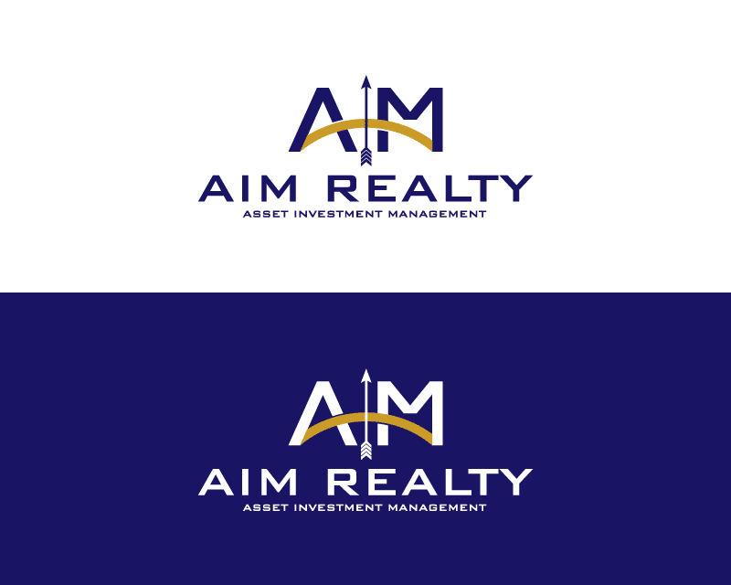
Fifteenth Design
This lovely design features the letters “A” and “M” on a bow. An arrow in the middle gives the logo movement.
The blue color combination conveys professionalism and trust, while the golden bow represents accomplishment. This logo symbolizes AIM Realty’s commitment to helping clients achieve their real estate goals with elegance.
The Winning Design
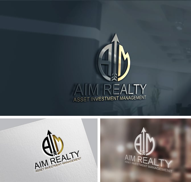
The winning logo has a subtle 3D aspect and radiates sophistication and professionalism. It subtly incorporates the letters “A” and “M” with an arrow, signifying development and direction.
The combination of gold and navy lends an image of richness and reliability. The company name “Aim Realty” and the tagline are displayed in large letters underneath. This design is the ideal choice for the face of the brand since it embodies AIM Realty’s dedication to innovation and excellence.
Check out other Real Estate Logo Design contests:
One Realty Group/ One Investment Group – Real Estate company targeting listings. A unique way of selling homes. Within one week or one weekend.
Patterson Real Estate Group – Primary Customer is the general public, homeowners, and those looking to purchase or sell a home. They are a real estate team of real estate professionals that sell residential real estate in the Phoenix area.
Imperial Real Estate – An independent real estate agency that helps people buy and sell homes. Their goal is to help build their empire. We want to help families get into the best possible home situation.
Beltrandi Real Estate – A local family-run Real Estate sales business since 1966. The target audience is people buying or selling houses.
Bright City Real Estate – Full cycle real estate development company. They purchase distressed homes, renovate them, and sell them to residential home buyers. Real estate focused on city environments in the Washington DC Area.
- George Ryan
- October 2, 2023

