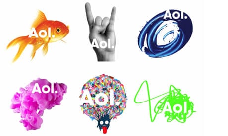
AOL just released its new branding look—one consistent typography showing "Aol" with different literally hundreds of "reveals" from various artists. We're only seeing a snapshot; the new identity fully debuts when AOL rings the bell to open the New York Stock Exchange Dec. 10. (Images here and after the jump with the release.) For Running Man devotees, AOL CEO Tim Armstrong assures paidContent the icon, which turned 13 this year, isn't having his number retired. "The running man is going to be around the brand. He's a huge part of the culture ... We're setting the running man loose." He says the figure will be popping up in some surprising places over the next couple of years. More from that interview.
An ad industry insider who looked at these first images tells us: "Using lowercase letters for 'Aol.' is too subtle a change to make a real impact on consumers, who may associate the company with the dial-up service. It's just a step. The different backgrounds are the same thing: they haven't made up their minds about what AOL is and what AOL isn't—and what it ultimately stands for." Stuart Elliot talked to the creatives at Omnicom's Wolff Olins who describe it as "all the things the Internet is"—and to Redscout's Jonah Disend, who thinks the AOL brand should be dissolved.

Comments (…)
Sign in or create your Guardian account to join the discussion